28 May Five Trends: Blogging and Typography
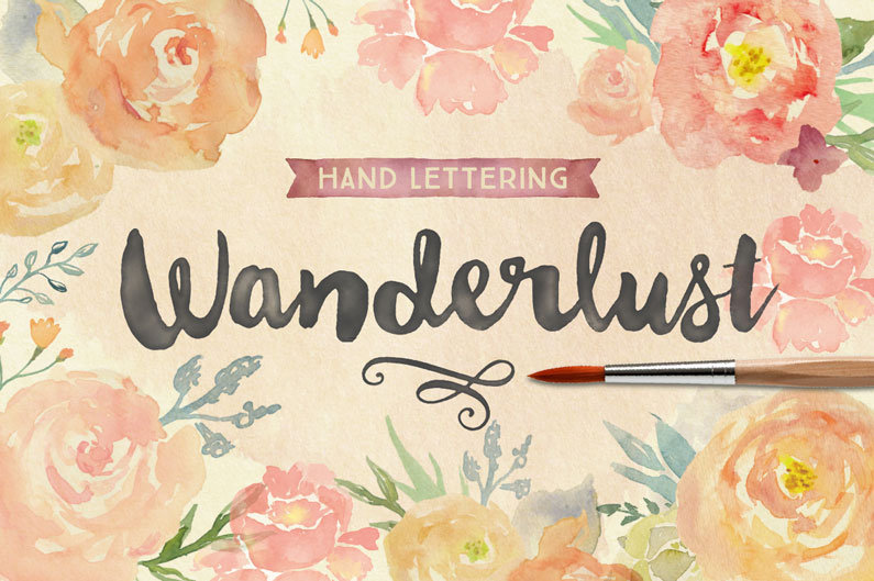
Over the last year or so, the watercolour splish splash and paintbrush typography with inspirational life quotes have been popular. Etsy is full of them posters, I’ve bought some wall art myself as I couldn’t resist and also to support a mum-designer-entrepreneur friend, check out her etsy store specialising in customisation of quotes and wedding vows.
I’ve also found some great resources, free and paid for watercolour templates to customise for the blog and font types for downloads. Creative Market is a great resource and this site gives you a beautiful curated list of fonts. I also found Perisa Lou a lovely site full of freebies and creative crafts, fun!
Everyone is on the bandwagon to creative a solo business and run it from home – it’s the trend these days and I am personally moving into the very same direction.
For now, what’s hip and trending in 2015
1. Clean and clearly branded blogs and sites: What does that mean?
It means when a user lands on your page, they immediately get a sense of your brand/identity and what your blog/site is about, is it food, fashion, travel, lifestyle? Are you a life coach selling classes? A graphic designer or a stay at home mum with plenty of tips sharing your journey. Your blog/site should have a logo, a profile photo – most great blogs invest in a professionally taken one. The site should be clean and fresh (not cluttered with every possible social channel and google ad)
2. Great and usually large format photos. We’ve moved into a visual world with really short attention spans, people search on Pinterest and Instagram more often than google if they are looking for products and people scroll quick and fast so bounce rates are high if you’re heavy on copy (unless your service and content is about writing and words and the reason why you have that site is specifically targeted to the audience who will spend a long time reading. If you are not confident about your photography skills, Death to Stock Photography is a resource many people use and they have a great library collection of photos. Best of all it’s free and you have a choice to upgrade to premium. I actually find more interesting photos there than say Getty images.

3. Inspirational quotes and water colour background designs. In the past year or so, that’s been visually pleasing and neat and likely to stay as there are shops devoted to selling crafts with this messaging.
4. Typography, lots of people are playing with beautiful type and creating inspiration quotes across their social channels. With tools and apps like Gimp, Picmonkey and the Made with Studio app, you’re golden. As long as you have some basic sense of aesthetics and look around your competition, you can pretty much mock up some pretty visuals yourself.
On the topic of typography, The Letter J Supply is a wonderful store you should check out if you’re in Singapore.
5. Call to action: Apart from a sales focused initiative that has pop up for sign ups and freebies, great blogs also incorporate the Click to Tweet function, so that calls out to the reader to help spread the word. Marie Forleo entrepreneur guru extraordinaire not only reminds people to click to tweet in her videos, there is a clear call to action call out there.
Found this useful? Spread the word! 🙂 Tweet: 5 #Trends on #Blogging: http://ctt.ec/5Fr0n+


Sorry, the comment form is closed at this time.